Eight refreshes Hong Kong Golf Club’s logo by embracing 127 years of tradition and heritage
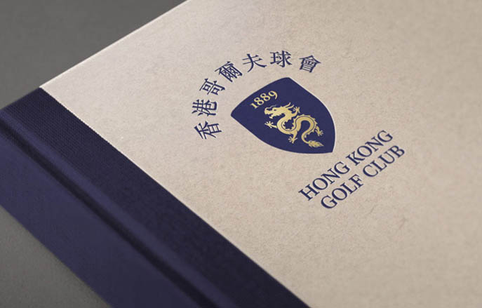
 The history-laden Hong Kong Golf Club has unveiled a refreshed visual identity designed by Eight. The new logo retains the iconic elements of the traditional shield, originally designed in 1889, and modernises it to make it more compatible for modern media applications, especially in the digital space.
Eight worked closely with Vice Captain Arnold Wong and General Manager Ian Gardner who consulted widely with past captains and a number of prominent club figures on the new look logo and brand guidelines. “We dug deeply into the history of the Golf Club to identify the drivers of the brand and leveraged the proud heritage that is so important to its legacy,” says Chris Fjelddahl, Partner at Eight.
A contemporary logo design evolved from the original version to represent the Hong Kong Golf Club as it continues to thrive in an ever-changing future, and to maintain the positioning of the club as a progressive and forward looking world-class sporting institution, respectful and aware of its proud history.
The initiative to refresh the brand identity was driven by the need to increase clarity, improve usability in new media, and create distinctiveness in cluttered visual environments. The new logo is built around a simplified version of the shield elements, including an updated dragon motif, English and Chinese mottos using blue and gold as the primary colours.
