MyRepublic unveils new branding developed in partnership with Superunion

WPP creative company Superunion has partnered with Singapore-based telecommunications provider, MyRepublic, to create a new brand identity marking its decade-long transformation from a challenger brand to an industry leader.
MyRepublic is one of the fastest-growing telecom operators in Asia-Pacific with operations across Singapore, New Zealand and Australia, and is the world’s first telecommunication company powered by a proprietary cloud platform. The changes to the identity reflect MyRepublic’s evolution over the past 10 years into a mature organisation with global-scale growth ambitions. This includes investment in consumer and enterprise connectivity services such as broadband and mobile units and the growth of its platform offer, a telco-to-telco business that brings MyRepublic’s cloud-based proprietary software based on open standards to telecommunication companies across the globe.
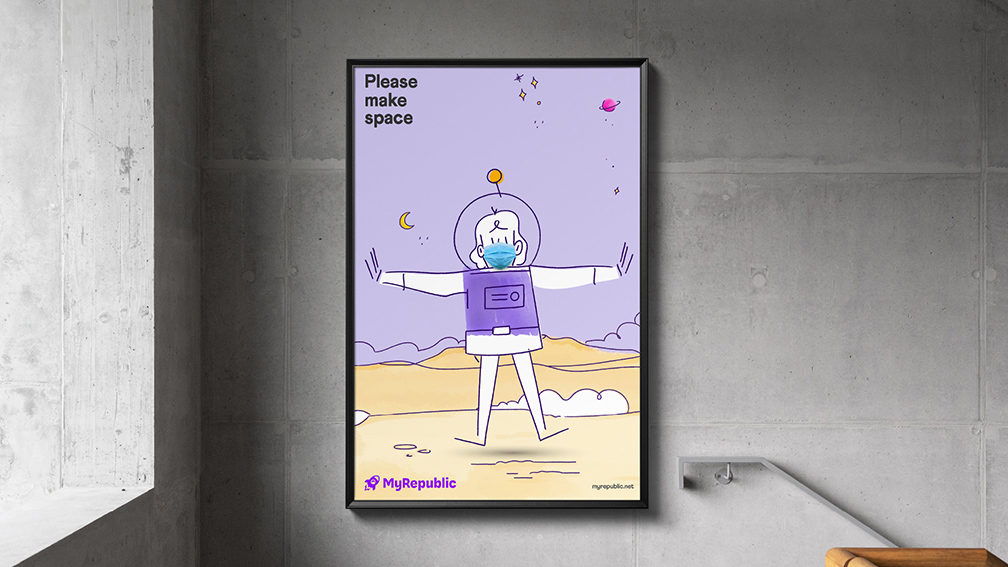
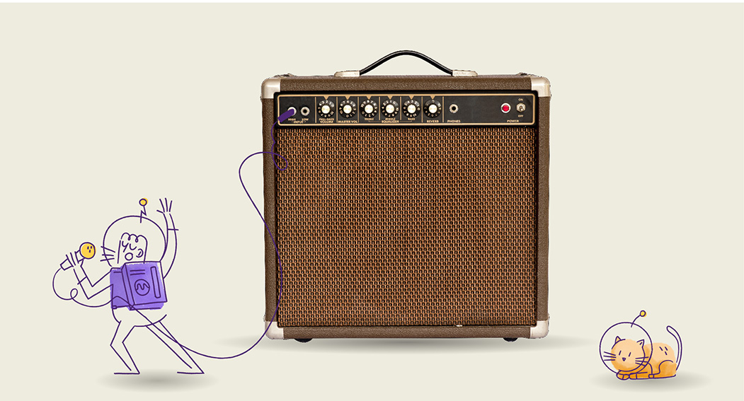
Developed by Superunion and MyRepublic’s in-house brand team, in collaboration with Amsterdam-based illustrator Raymond Burger, the new identity has been designed with screen-first principles.
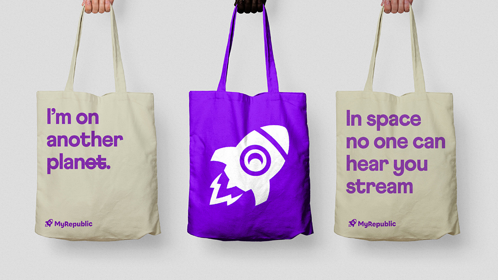
Using an evolution of the brand’s signature rocket silhouette, set against its iconic purple brand colour, the new logo simplifies and modernises the original marque to be instantly recognisable, no matter if viewed on a 50-inch display or a five-inch smartphone.
The new logo is a key milestone in MyRepublic’s work with Superunion to transform the brand, an ambition unveiled in April 2021, when the company refreshed its brand to emphasise its mission to be the world’s largest enabler of deep, meaningful, and trusted relationships between customers and tech products.
In addition to the master brand, Superunion designed logos for MyRepublic’s Gamer and Business offerings, to provide a seamless customer experience across the brand’s diverse portfolio of tech products.
The new logo is being rolled out across MyRepublic’s digital marketing assets, including its website, digital advertising and social media, as well as an updated consumer experience in MyRepublic retail stores.
Enning Yow, Head of Creative Studio and Insights, said: “The new brand identity resonates with our customers and differentiates us in the category. It captures the essence of MyRepublic – friendly, approachable, but also a little quirky and geeky. The launch of the new logo is the culmination of tireless work the team has put into the brand refresh and is a milestone for our growth as a company.”
Scott Lambert, Creative Director, Superunion Singapore, said: “MyRepublic launched into the market ten years ago with an ambition to transform connectivity. That ambition has been realised for hundreds of thousands of customers in their homes and businesses, and for telcos across the region. This incredible shift from challenger to industry leader needed to be reflected in the brand. We worked closely with the team at MyRepublic to create an identity that retained brand equity but reflected who the brand really is today to its people, customers and partners. By aligning sub-brands into the master and creating a screen-first identity, the new brand reflects the maturity of the organisation as well as its innovative spirit.”


