Talented India launches “Why is this a Swiggy ad?” campaign for online platform Swiggy
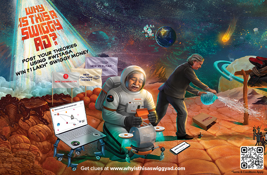
There’s a new ad in town. Actually, across towns. It’s definitely a Swiggy ad… we just don’t yet know why.
Created via Talented India the “Why Is This A Swiggy Ad?” or #WITASA turns the basic premise of advertising on its head. Instead of focusing on coherence of message and brand connect, WITASA makes the brand connect itself the device to engage – and reward fans, with Rs. 1 lakh in Swiggy Money. Talented engaged with partners Nishikant Palande & Web Dimension to take the campaign experience across print, OOH and digital.
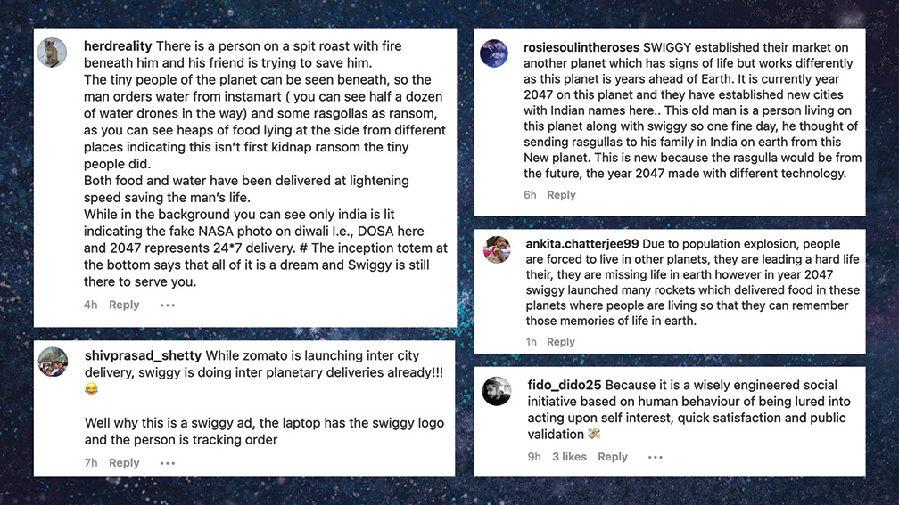
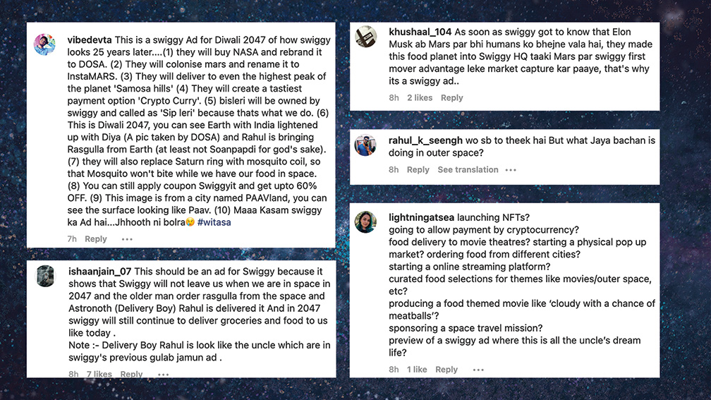
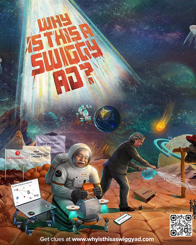
What all this means is India’s biggest food ordering & delivery platform has now released a ridiculous visual set in space, filled with unexpected clues, with evidently one theory that can make sense of it all. Will the internet crack it? Only time, and theories, will tell. The internet is buzzing with crazy theories already.
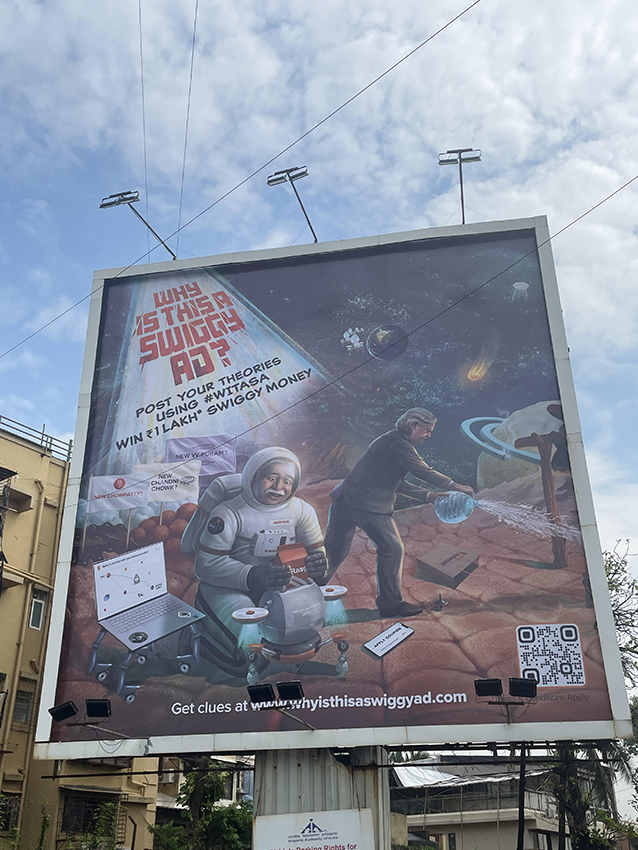
While the chatter and theories about the campaign are online, the campaign was first released on OOH across Delhi, Bengaluru and Mumbai – and today – in front page print, again in Delhi and Bengaluru. Betting on the nature of the social internet – looking at print and outdoor not as ends in themselves, but as means to a print or outdoor-led viral opportunity.
Ashish Lingameni, Head – Brand, Product Marketing and Sustainability at Swiggy, said: “Given how ubiquitous Swiggy is and how we have become a part of the cultural fabric, we believe that users can imagine Swiggy playing a role in almost any situation and context. Additionally, younger digital-first users are also increasingly looking for brands to engage them with experiences rather than just target them with ads. These two together took us down an interesting road of turning an advertisement into an online discussion of “Why is this a Swiggy ad”. Effectively, the greatest ads are those that result in furious discussion amongst users and this campaign is conceptualized to try and make precisely that happen.”
“While I know the answer, I can’t tell you WHY this is a Swiggy ad but I can tell you HOW it became a swiggy ad. It was the most enjoyable creative process, with relentless hours of making plots and sub-plots and weaving a story that you’d hear only once in your lifetime. The inspiration was 50s illustration style and sci-fi comics and movie posters (think Other Worlds, Space Man, At the Earths Core). It was a conscious choice to make the visual an illustration to break the monotony and also to fully justify the madness we had in our minds. And of course, it took a village. Right from a fantastic client team, who were the secret sauce in making this campaign come alive at its creative best, to my colleagues at T6D and to partners like illustrator Nishikant Palande and website partner Kalpit Dwivedi,” says Teresa Sebastian, creative at Talented.
The campaign website is designed to help fans of the campaign explore each element in extreme detail, and unlock hidden clues that will help them crack the mystery.

1 Comment
I think swiggy will deliver our order by drones