KesselsKramer honors Dutch-Japanese ties with visual identity for the Netherlands at Expo 2025
Creative agency KesselsKramer has developed the visual identity for the Netherlands pavilion at Expo 2025 Osaka. The agency’s “Common Ground” design concept has successfully positioned the Dutch pavilion as one of the standout attractions at the global event. This marks the second consecutive World Expo collaboration between KesselsKramer and the Netherlands, as this year’s design project builds on the agency’s acclaimed work for Expo 2020 Dubai.
KesselsKramer has introduced a multifaceted approach including a narrative, visual identity, and integrated campaign strategy which has successfully differentiated the Netherlands pavilion among the 150+ participating countries at Expo 2025.
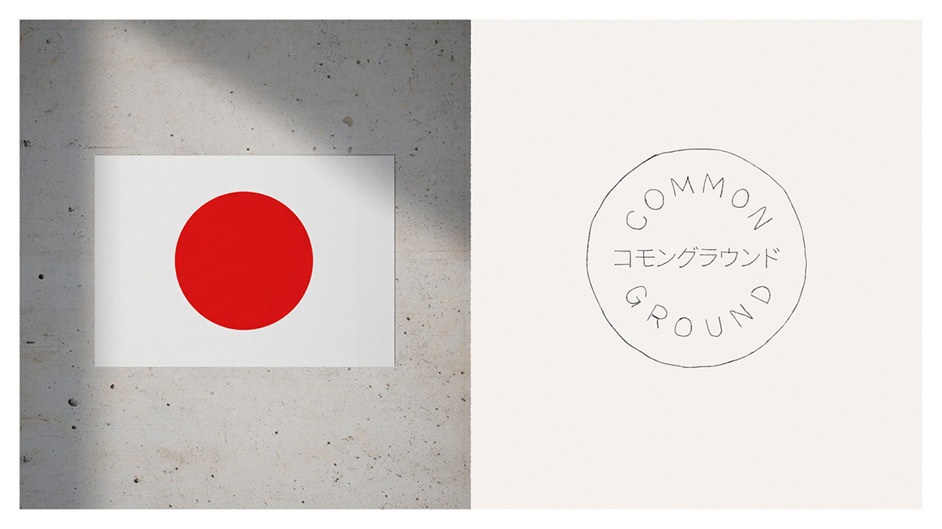
Drawing inspiration from the 425-year history of Dutch-Japanese relations, KesselsKramer developed the ‘Common Ground’ concept as both a literal and metaphorical platform for cross-cultural exchange and collaborative innovation.
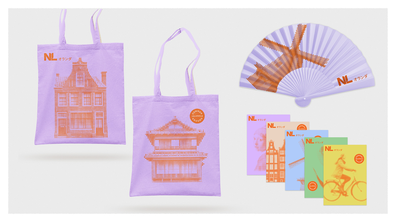
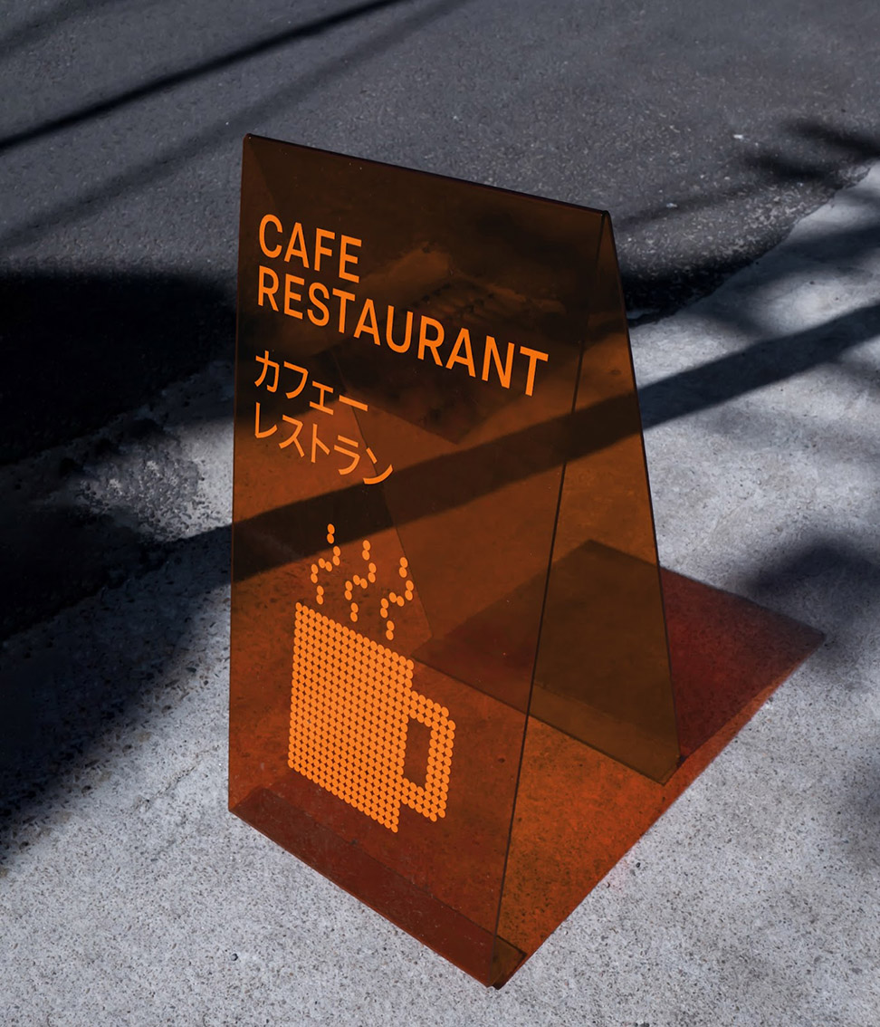
At the center of the identity system is an orange dot. An homage to the Japanese flag, reimagined in the Netherlands’ national color. The dot pattern illustrations throughout the pavilion and campaign materials pay tribute to Dutch graphic designer Wim Crouwel’s iconic work for the Netherlands pavilion at the 1970 Osaka Expo. The illustrations symbolize the overlap between Dutch and Japanese traditions.
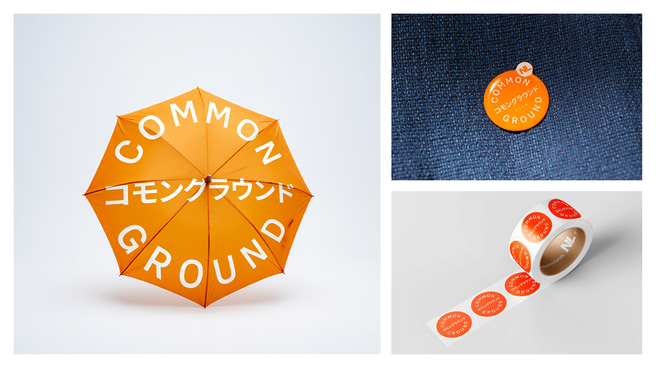
“With ‘Common Ground,’ we wanted to create something that not only honored our shared history, but also made room for future collaborations. The Netherlands is a small country and we know that the only way to overcome global challenges is to work together.” said Gijs van den Berg, Creative Director at KesselsKramer. “We’ve created a visual language system that flexes across all touchpoints. By creating an extensive toolkit and custom coded tools, the design is applied from architectural elements to digital platforms, merchandise, and communications materials.”
The agency developed a comprehensive design toolkit based on the orange dot motif, creating a cohesive system that extends beyond the physical pavilion to encompass wayfinding, social media campaigns, promotional materials, and cultural programming. The ‘Common Ground’ concept served as the foundation for the pavilion design by the consortium of RAU, Tellart, DGMR, and Asanuma, who translated the orange dot into an illuminated orb.
Since the Expo’s opening, the pavilion has attracted significant visitor attention and media coverage, with the distinctive orange dot identity becoming a recognizable symbol throughout the Expo grounds.