Hyundai Card launches ‘Alphabet Card’ as its own independent brand universe
This is the brand philosophy of Miu Miu, as explained by Miuccia Prada, head of the Italian fashion house Prada. Named after her childhood nickname, Miu Miu allowed her to freely pursue creative directions distinct from the restrained and refined brand that is Prada. In short, Miu Miu served as a playground to unleash the creativity and rebelliousness within her.
Contrary to initial concerns, Miu Miu’s experimentation did not compromise Prada’s identity; instead, it made Prada’s core identity even clearer. Furthermore, it expanded the spectrum of the entire Prada Group to consumers in their 20s and 30s, who place a high value on individuality and trends. It is a virtuous cycle where a strong brand reinterprets itself, and that variation, in turn, strengthens the master brand.
A similar dynamic is now unfolding in the Korean financial sector with Hyundai Card’s newly unveiled independent brand, the ‘Alphabet Card.’ The launch of the Alphabet Card is more than just the release of a new product; it represents an expansion of Hyundai Card’s brand universe, revealing another facet of its alter ego. For this reason, industry observers are comparing Hyundai Card’s Alphabet Card launch to the relationship between Prada and Miu Miu.
From a Lifestyle “Product Lineup” to an Independent Brand
The revival of the Alphabet Card after nearly 20 years, along with its emergence as an independent brand, is grounded in a consumer culture that is more segmented and personalized than ever before. Until now, the core of Hyundai Card’s lineup centered on versatility—allowing customers to enjoy benefits anywhere with a single card, such as ‘M (points),’ ‘X (discounts),’ and ‘ZERO (unconditional benefits).’ However, shifting consumer culture created a need for ‘specialized’ products tailored to individual lifestyles. This is why Hyundai Card released 11 distinct cards specialized in areas such as beauty, dining out, shopping, recurring payments, and travel.
In other words, while maintaining versatility as a core strategic pillar for consumers who prefer simple and convenient credit cards, Hyundai Card launched the Alphabet Card as a new vehicle for consumers pursuing specialized lifestyles. Reflecting the spirit of a new era, Hyundai Card built a unique brand universe for the Alphabet Card, elevating the cohesive brand experience across everyday touchpoints—from the physical credit cards to design, typography, packaging, pop-up stores, and merchandise.
While Hyundai Card strongly expresses its signature identity through minimalism, the Alphabet Card is more experimental and free-spirited. It scales back the prominence of the ‘Hyundai Card’ name on both the product titles and the physical cards themselves, replacing it with the Alphabet Card’s independent design identity, which is characterized by bold colors and robust typography. Additionally, individual alphabet letters take center stage on each plate, offering variations through contrasts in color and texture across three plate options: Half Metal, Bright, and Soft.
Furthermore, a dedicated Alphabet Card typeface was introduced to visually embody its universe. While it shares a common foundation with Hyundai Card’s ‘Youandi’ font by using the proportions of a standard credit card (1:1.58) as a motif, Youandi represents Hyundai Card’s refined identity, whereas the new Alphabet Card typeface expresses a diverse lifestyle identity. It features sharp corners that contrast with the card’s rounded edges, alongside flexible scalability across various mediums. Through this typeface, the card plates, packaging, and various merchandise seamlessly align under a unified branding language.
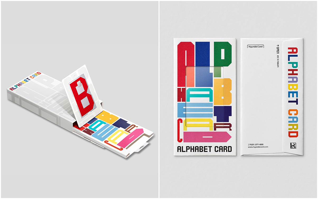
Hyundai Card views the packaging—the very first touchpoint with cardholders—as an essential domain of branding, transforming the unboxing process into a uniquely enjoyable experience. For the metal card packaging, pulling the inner sleeve causes the card plate to pop out dramatically. The precise angle, standing position, and timing were perfected through rigorous testing. Meanwhile, the paper mailing envelopes for the plastic cards were designed vertically to harmonize with the card’s layout.
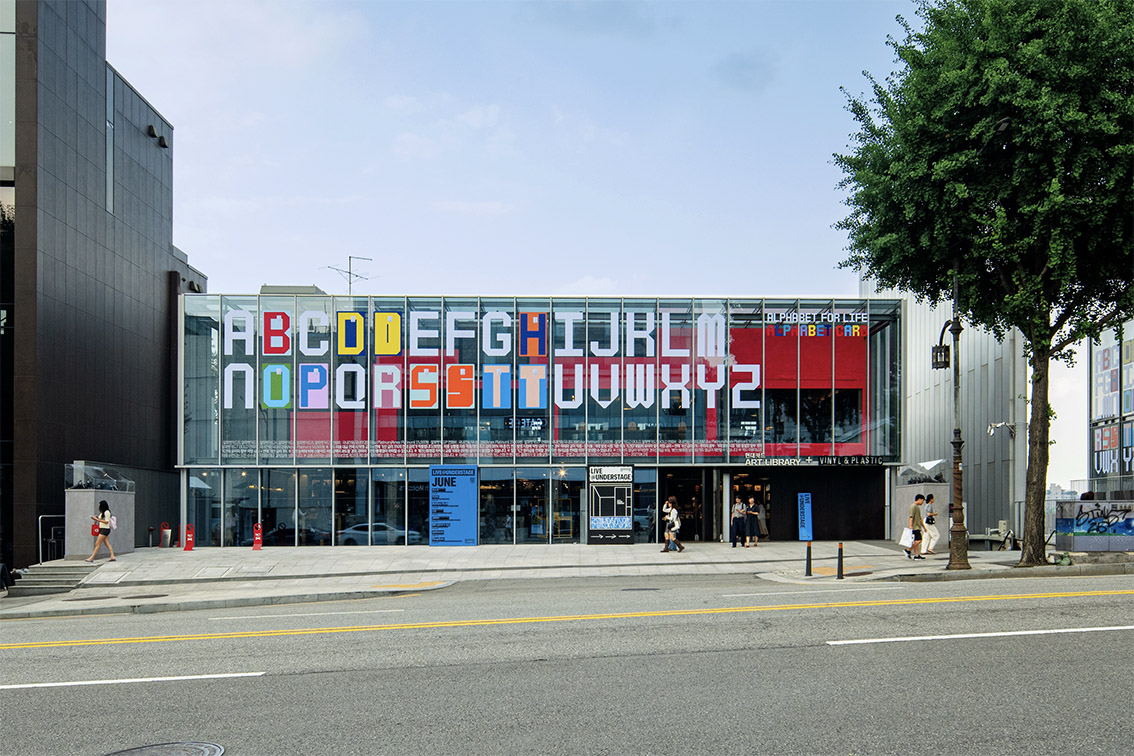
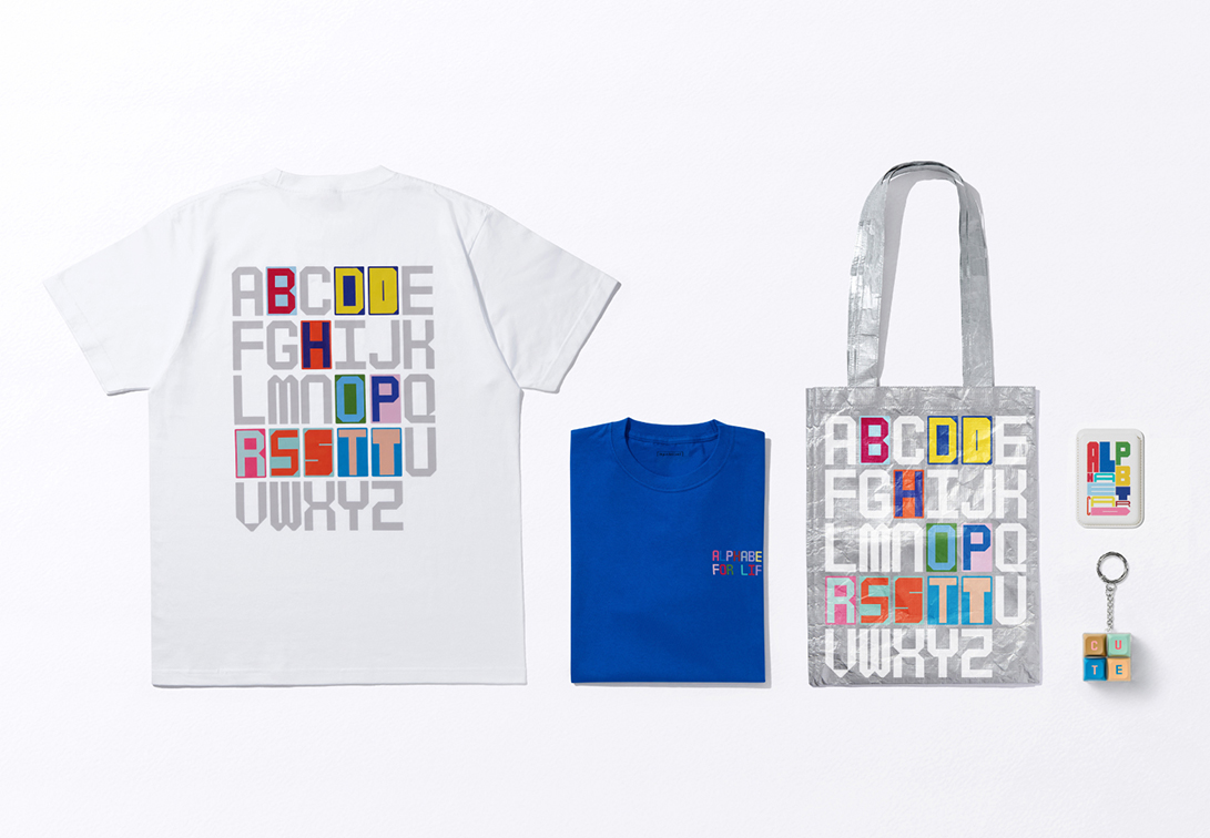
Hyundai Card is also running a pop-up store at Vinyl & Plastic in Hannam-dong, Seoul, through September 13, where visitors can directly experience the Alphabet Card’s distinct universe. This pop-up space goes far beyond merely displaying credit cards: visitors can play with and arrange alphabet letters at the Magnet Zone and create custom keycap keyrings at the Keycap Creation Zone. Additionally, branded lifestyle items such as bags, t-shirts, and smartphone card wallets are available for purchase at the Goods Zone. Through this, Hyundai Card has successfully extended the Alphabet Card’s branding into everyday items that allow consumers in their 20s and 30s to express their individuality.
An Experimental Identity Rooted in a Powerful Brand
Industry experts note that this new experiment with the Alphabet Card is, paradoxically, made possible precisely because Hyundai Card possesses such a formidable brand identity. Just as Miu Miu’s radical approach was embraced as ‘creativity and rebellion’ rather than dismissed as mere ‘caprice’ because it was backed by an established, serious brand like Prada, a stronger master brand makes it clearer just how far its identity can expand. Brands with vague identities have far less room to maneuver, as it becomes difficult for consumers to discern how new concepts differ from the status quo.
Indeed, few would dispute that Hyundai Card sets the benchmark for corporate branding in Korea. Groundbreaking initiatives, such as creating a proprietary corporate typeface, elevating the very concept of card design, directly planning cultural events, and building and operating dedicated brand libraries, have laid the foundation for corporate branding in Korea. Furthermore, Hyundai Card has reached a level where anyone can instantly feel that distinct ‘Hyundai Card essence’ even if the brand name isn’t explicitly written. Many companies have attempted to follow suit, but none have successfully replicated the Hyundai Card formula.
Industry insiders predict that the distinct brand positioning of both Hyundai Card and the Alphabet Card will ultimately broaden the horizons of the entire Hyundai Card portfolio. Just as Miu Miu evolved from being known simply as ‘Prada’s younger sister’ into a brand that made the entire Prada Group younger and more dynamic, expectations are high that Hyundai Card will successfully appeal to consumers in their 20s and 30s—who prioritize self-expression and savor their daily lives—through the Alphabet Card.
“Establishing an independent brand universe for the Alphabet Card across design, typography, and packaging was possible solely because Hyundai Card is already a powerful brand,” a Hyundai Card representative stated. “Through the distinct brand plays of both Hyundai Card and the Alphabet Card, the overarching Hyundai Card universe will expand even further.”