Presentable India rethinks supplement packaging with modular ‘vial’ identity
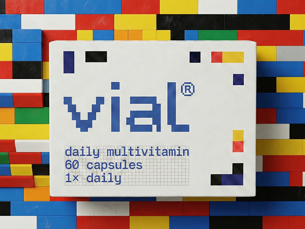
Independent design studio Presentable, based in Gurugram, India, has created vial, a multivitamin packaging and identity project that moves away from the clinical and corrective language traditionally associated with supplements.
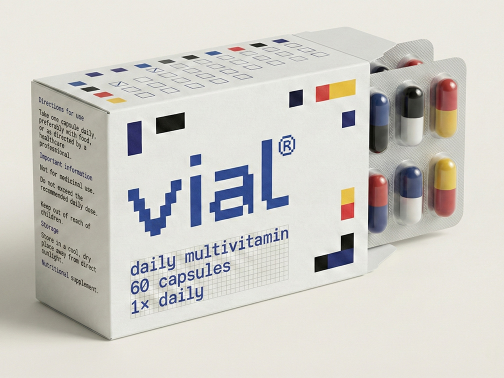
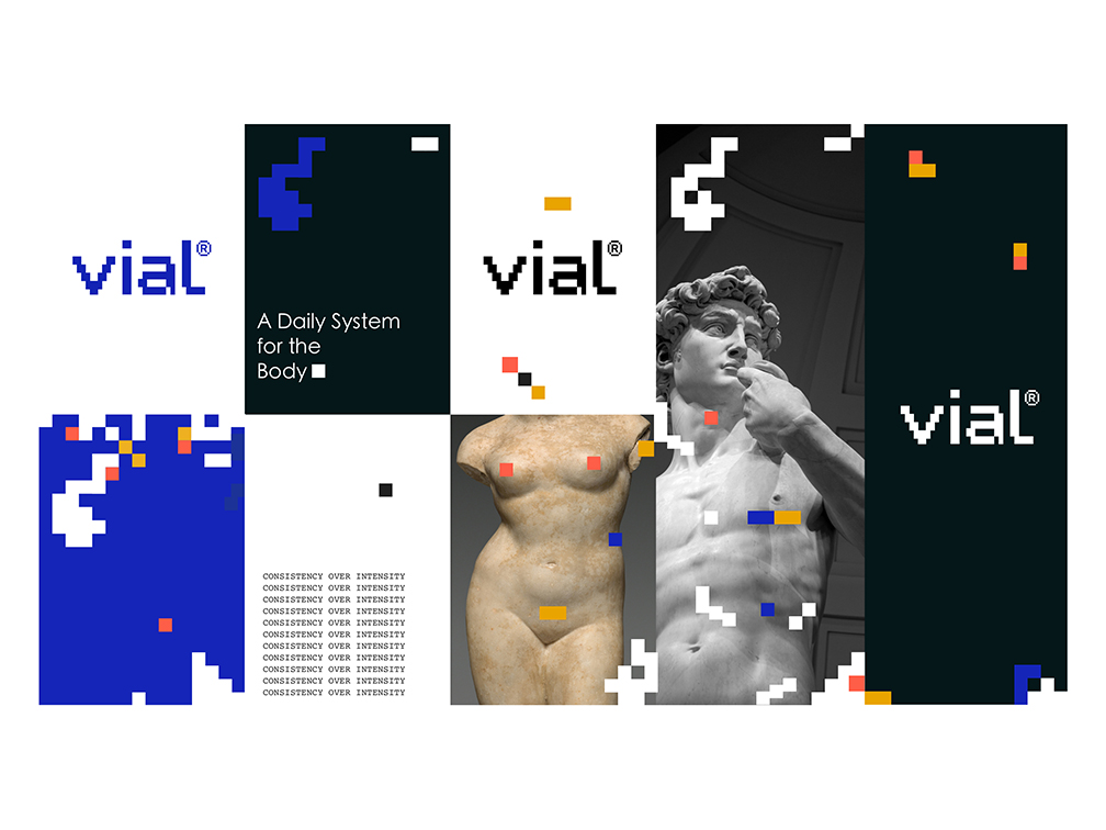
Instead, the identity frames daily nutrition as a structured, accessible ritual, using a minimal, system-led approach built around a modular grid, restrained typography and colour as an information tool rather than a sales device.
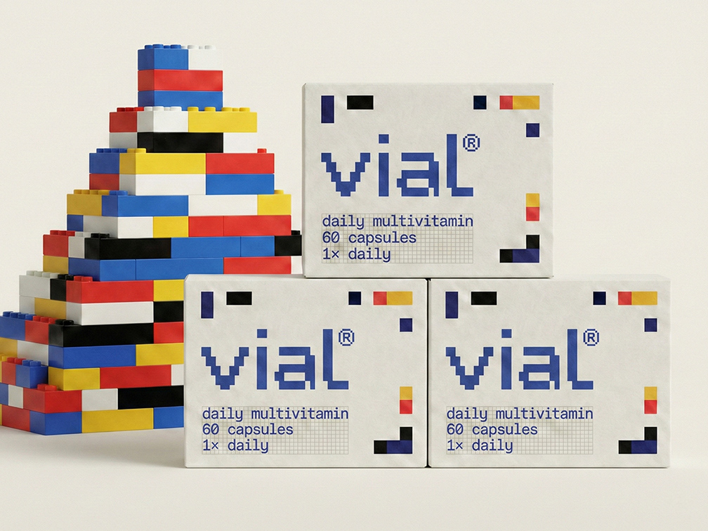
The visual system takes inspiration from the compositional clarity of Piet Mondrian and the modular stacking logic of Tetris, with each geometric unit representing an individual nutrient within a larger whole. Elements align, stack and occasionally fall away to reflect the idea that wellbeing is cumulative and constantly evolving.
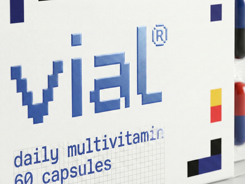
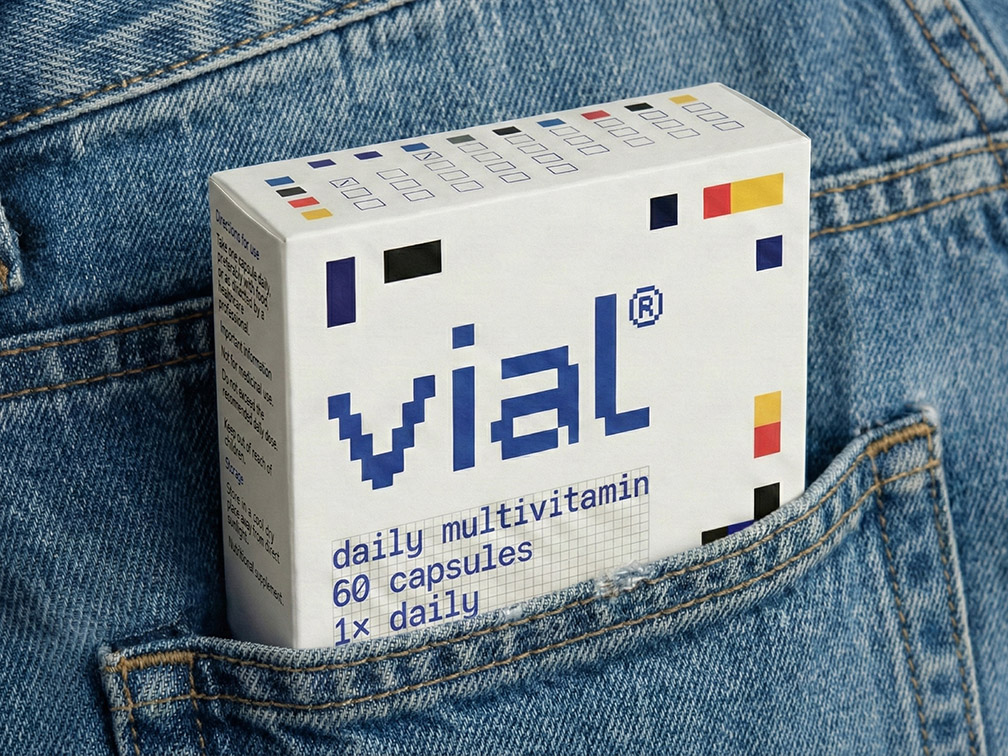
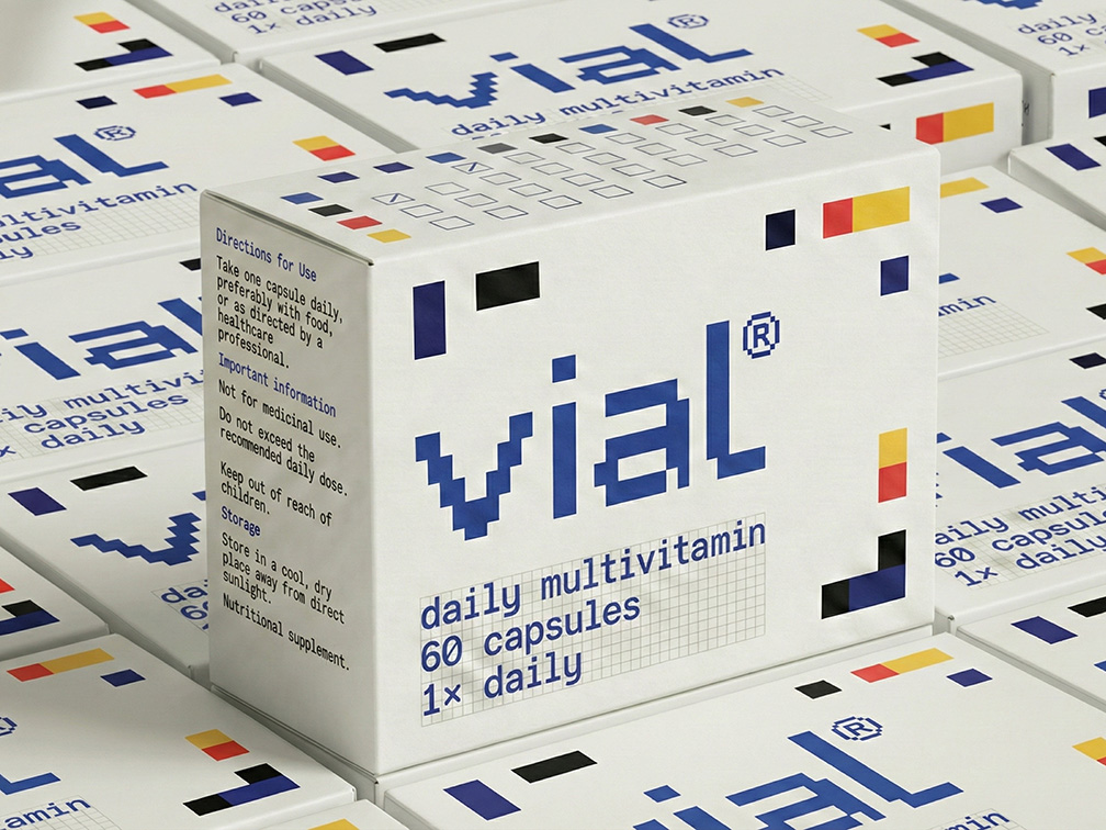
The grid also informs the vial logotype and extends across the packaging system, creating a consistent visual language. Each colour represents a specific nutrient, while the restrained typography prioritises clarity and legibility. Integrated checkboxes allow users to mark their daily intake, turning the packaging into a simple interface for building routine and consistency.
Presentable says the thinking behind the identity is also rooted in India’s own design history. In 1957, the Government of India invited designers Charles and Ray Eames to advise on the country’s approach to consumer design. Their subsequent 1958 report emphasised the principle that every element should serve a purpose, famously using the traditional Indian lota as an example of functional design refined through generations of use.
Presentable applies that principle to a contemporary consumer product, positioning structure as an expression of care and consistency as a visual language for wellbeing. The result is a packaging system designed to make supplements feel less like an intervention and more like an everyday ritual.