Superunion creates new brand & visual identity for luxury hotel brand Shangri-La Group
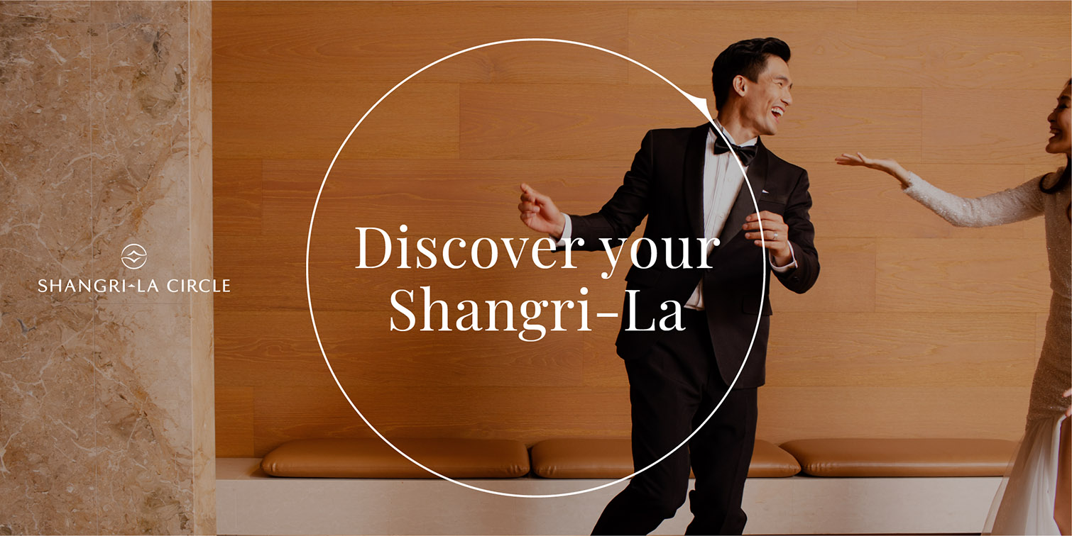
WPP creative company Superunion has partnered with luxury hotel brand, Shangri-La Group, to rebrand its award-winning rewards programme, the newly named Shangri-La Circle, formerly Golden Circle. The new brand reflects the rewards programme’s evolution to a lifestyle platform for a new generation of travellers, creating a digital gateway to a diverse range of experiences across the whole Shangri-La Group.
The transformation of Shangri-La Circle follows the launch of Polaris, a new exclusive invitation-only elite membership tier, in December 2021, with the brand created by the Superunion Asia team.
The creation of Shangri-La Circle is driven by the group’s commitment to innovation in how it rewards and engages with guests around the world. Superunion was tasked with the creation of a new brand strategy, tone of voice and visual identity to reflect Shangri-La Circle’s new positioning as ‘Curators of the Good Life’, and to express an invitation to a personal journey of discovery.
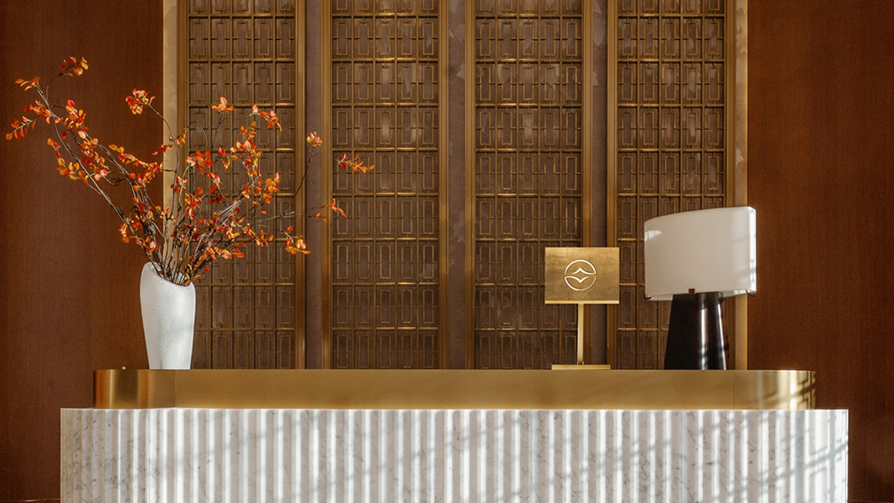
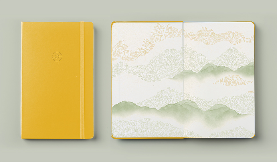
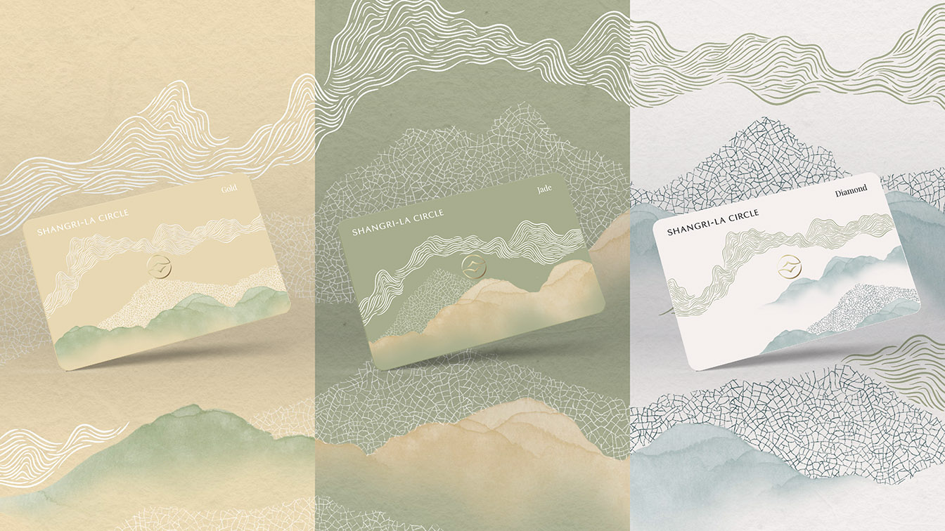
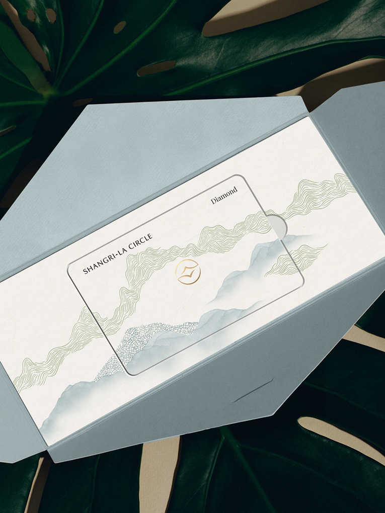
The concept of ‘discovery’ is brought to life through a new, dynamic visual identity through an artistic reinterpretation of a compass that helps members navigate the world of Shangri-La experiences, including hotels, bars and restaurants, guiding them to discover their personal Shangri-La. Inspired by Asian calligraphy, the brand icon draws on the equity of the original Golden Circle marque, reinterpreted for a digital age, and subtly references the ‘Shangri-La ‘S” iconic letterform.
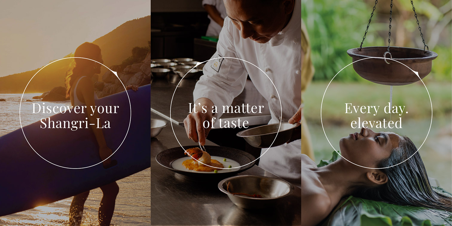
Superunion created a custom pattern inspired by Asian crafts like woodblock printing, porcelain, watercolour ink and rice paper to reflect the brand’s heritage in Asian hospitality and to create a sense of warmth and attention to detail. The colour palette draws on Shangri-La’s legacy but adds a bold yellow to reflect the evolution of the gold of the Golden Circle marque, while art direction guided a photography shoot intended to capture the good life. Superunion’s development of the brand’s tone of voice matches the warmth of the visual identity, to make members feel intrigued, engaged and welcomed across every customer experience.
Benedict Gordon, CEO, Superunion Asia, said: “Shangri-La is an iconic brand, and the Shangri-La Circle reflects both the impressive heritage of the rewards scheme as well as the business’s forward-facing focus on creating an experience-led brand across every touchpoint. We wanted to stay true to the brand’s heritage by rooting the visual redesign in Asian culture and to bring to life the warmth of the brand in every interaction with members. This new identity reflects Shangri-La’s position as a global iconic brand and symbolises a revolution in how moments of discovery and curated experiences are designed.”
This brand was created by Superunion Hong Kong, with support from the Singapore and Shanghai studios, and utilised Superunion’s creative technology capabilities to create an identity designed to work seamlessly across digital platforms as well as physical touchpoints. The brand will be demonstrated across a wide range of applications including the app, website, membership cards, welcome packs, gifts and amenities.
Credits
Superunion – Creative Agency
Cecylia Grendowicz – Strategy Director
Gianluca Crudele – Design Director
Claudia Li – Client Director
Eugenia Chui – Client Manager
Jessica Tan – Creative Digital Director
Irene Wu – Strategist